


Context Changes Everything
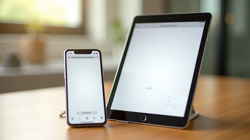
Here’s where Malaysian web design gets interesting. People read differently depending on where they are. Someone reading on a 6-inch phone while on public transport needs different sizing than someone at their desk with a 27-inch monitor. You’ve got to design for all of them.
Mobile demands careful consideration. On a 5-6 inch screen, 16px body text is actually quite large. That’s intentional. Mobile users typically hold devices closer, so smaller absolute sizes work. But don’t get clever — responsive design means your 16px scales appropriately across devices, not that you shrink it to 12px on mobile.
For touch interfaces, there’s another layer. WCAG recommends a 48px touch target minimum. That includes not just button size but the clickable area around text links. A 16px link might need 32px of surrounding space to be truly accessible. This matters when you’re designing forms or navigation.